Adrian T. Otoo
Contact me
Giving Fig a functioning design system, brand alignment and app design
September 2025 • FIG
Background
Fig is a fintech app for [investing / tracking stocks — describe what it actually does in one line]. I got the chance to work on it when I first joined Tethys Design Studio. Fig's product had been growing faster than its design foundations: the existing design system was out of date, and inconsistencies had crept into the app screen by screen.
The Problem
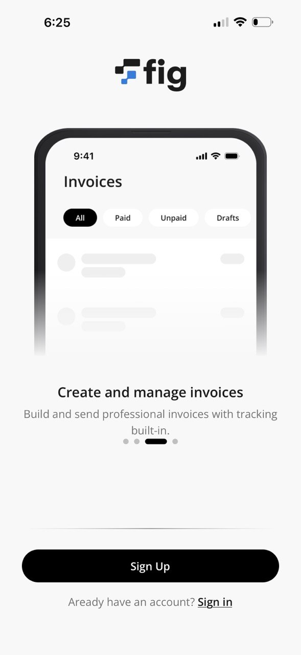
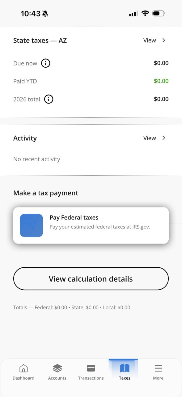
The system wasn't failing loudly, it was failing slowly. [What did you actually find — duplicated components? Multiple button styles? No token structure? Spacing drift? Name 2-3 real symptoms.] For the team, that meant every new screen took longer than it should, and the app's visual quality depended on which file you happened to be working in. A fintech product asking people to trust it with their money can't afford to look inconsistent.
My Approach
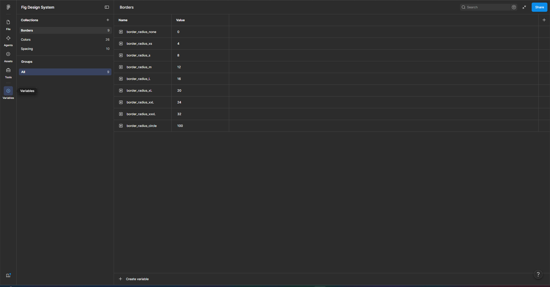
I audited the existing system to map what was actually in use versus what the library claimed, then migrated it to an atomic structure: tokens and foundations first, then components, then the patterns built from them. [Adjust to what you really did.]
Tasks
- Establishing the brand’s identity
- Building a scalable design system
- Redesigning key flows and features
Building the design system
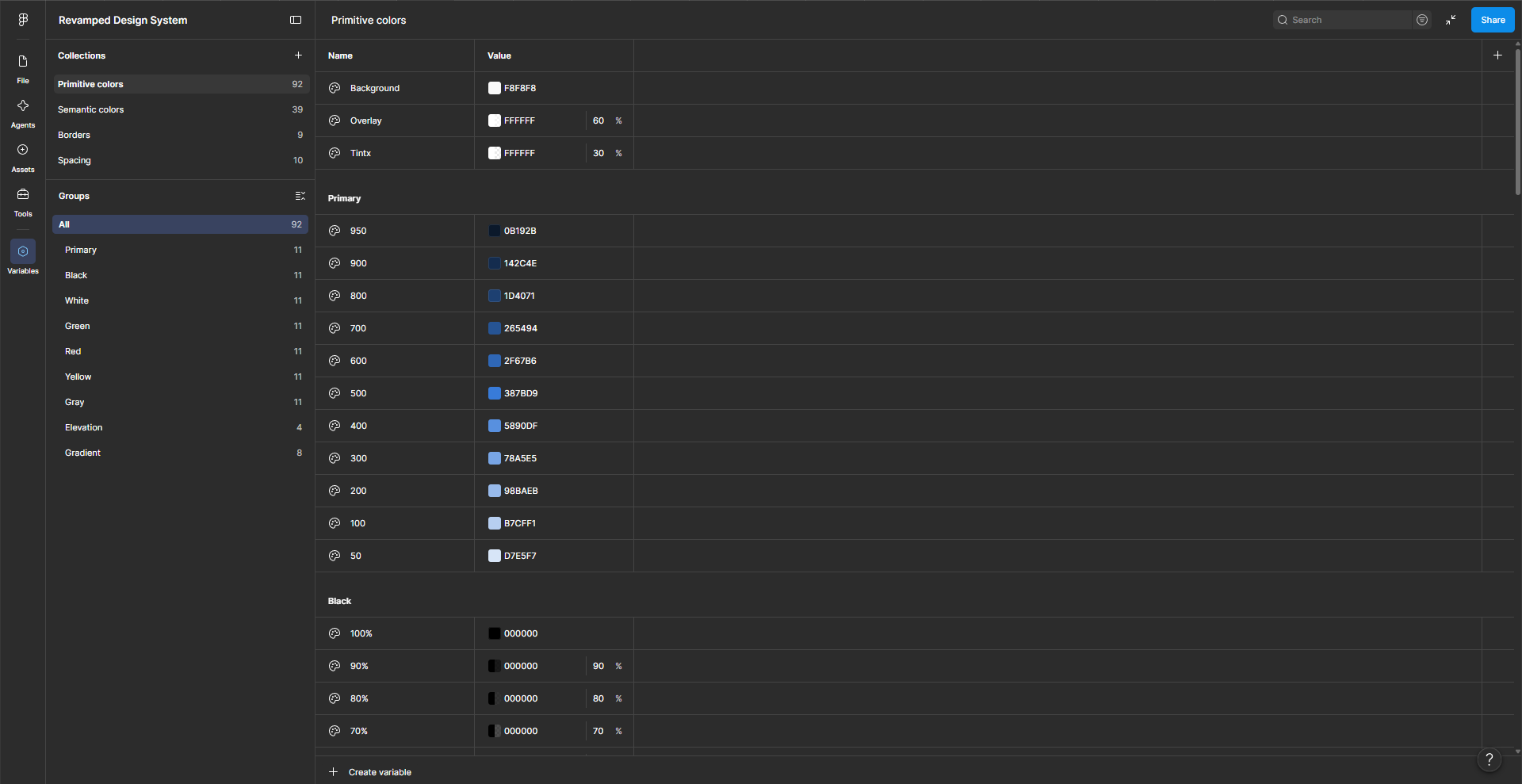
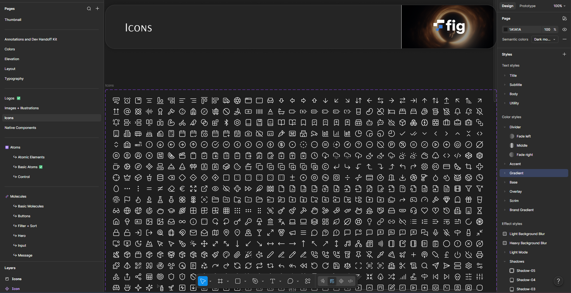
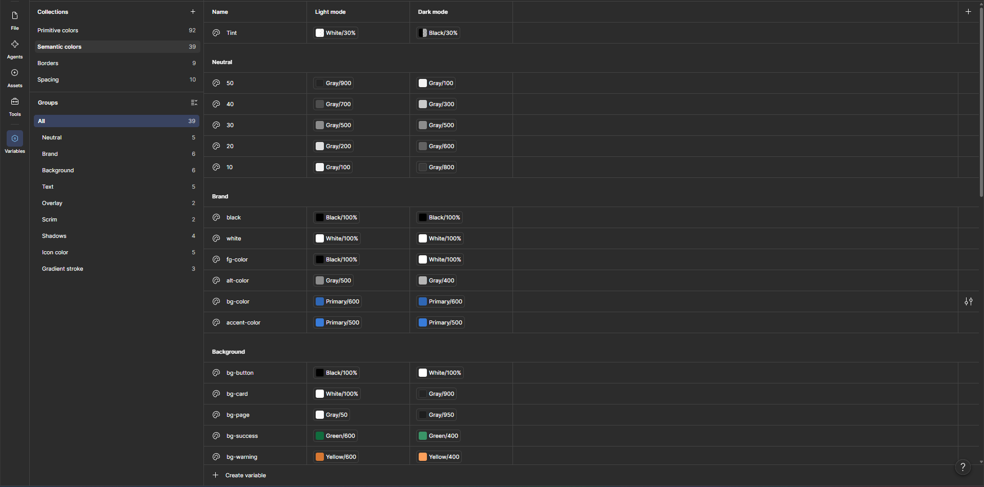
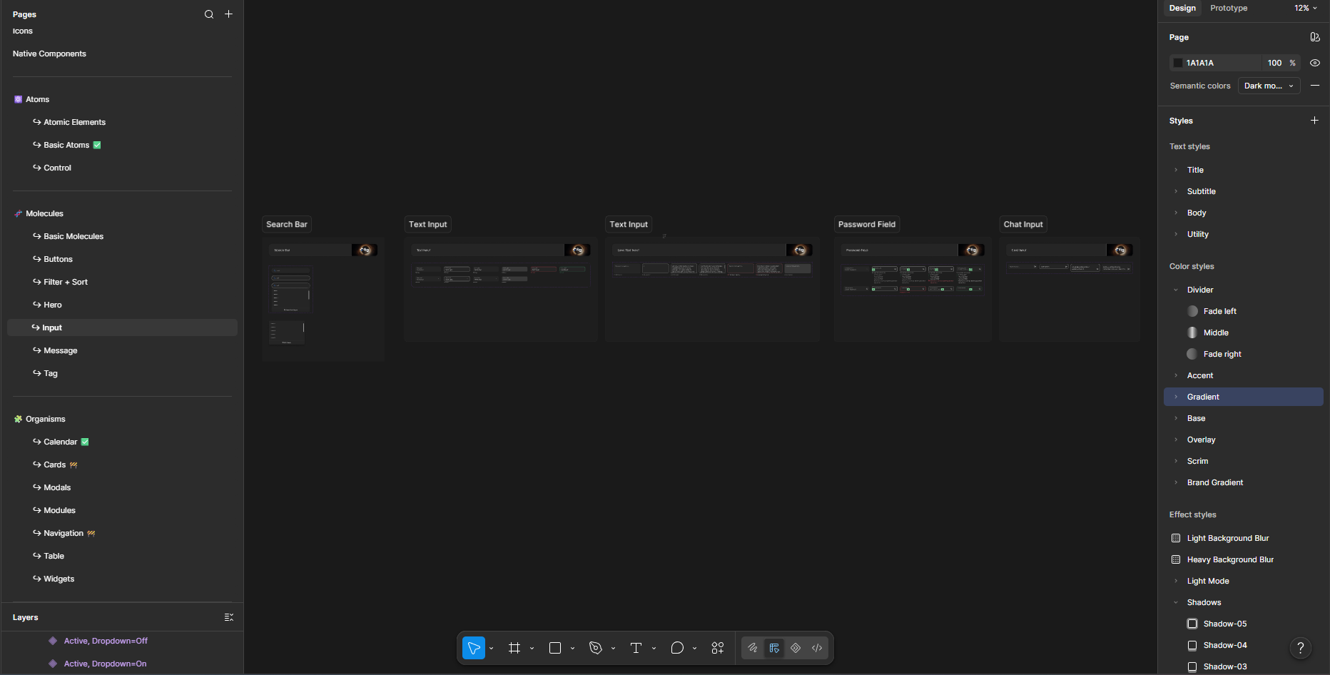
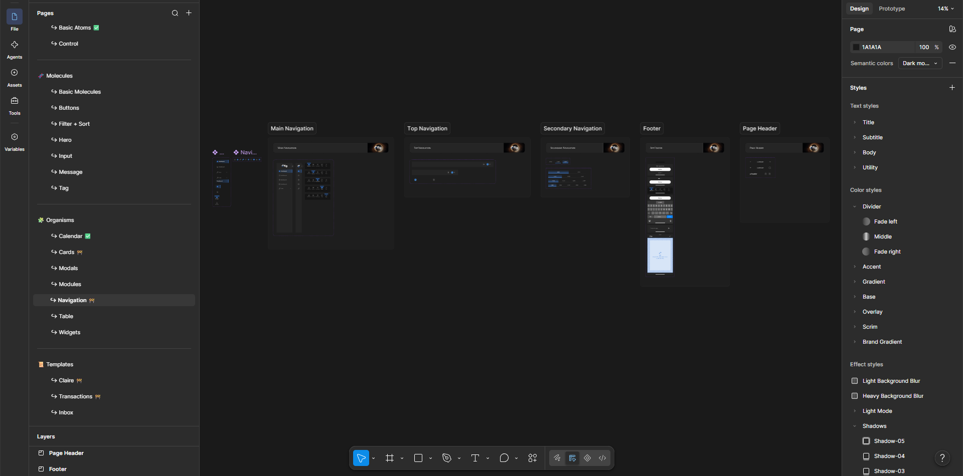
[Concrete scope beats adjectives here. Anything true like: "consolidated X button variants into one component set," "rebuilt the color system into ramps with accessible contrast pairs," "defined a type scale to replace ad-hoc sizes." Even two specifics transform this section.]
Documentation after building
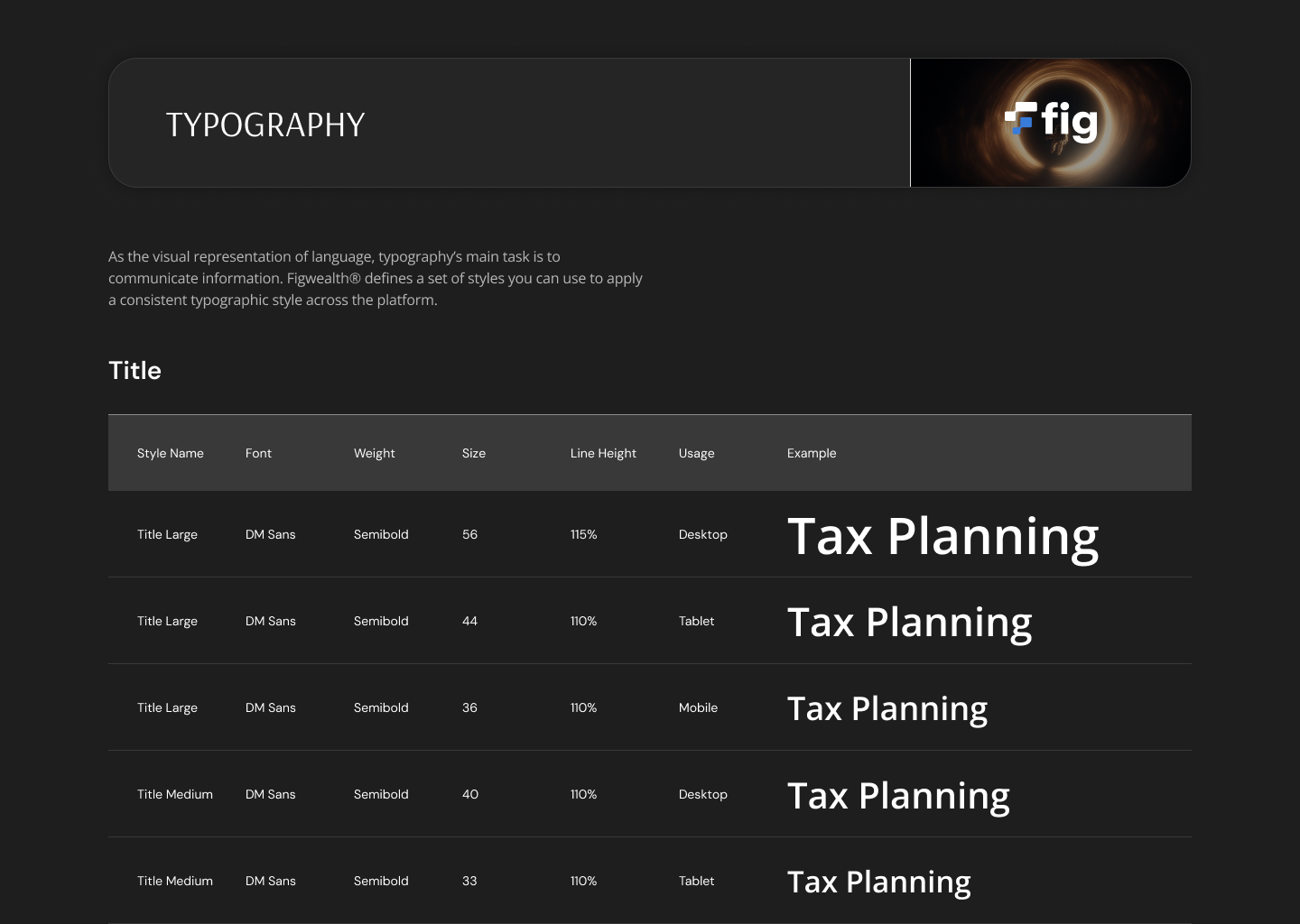
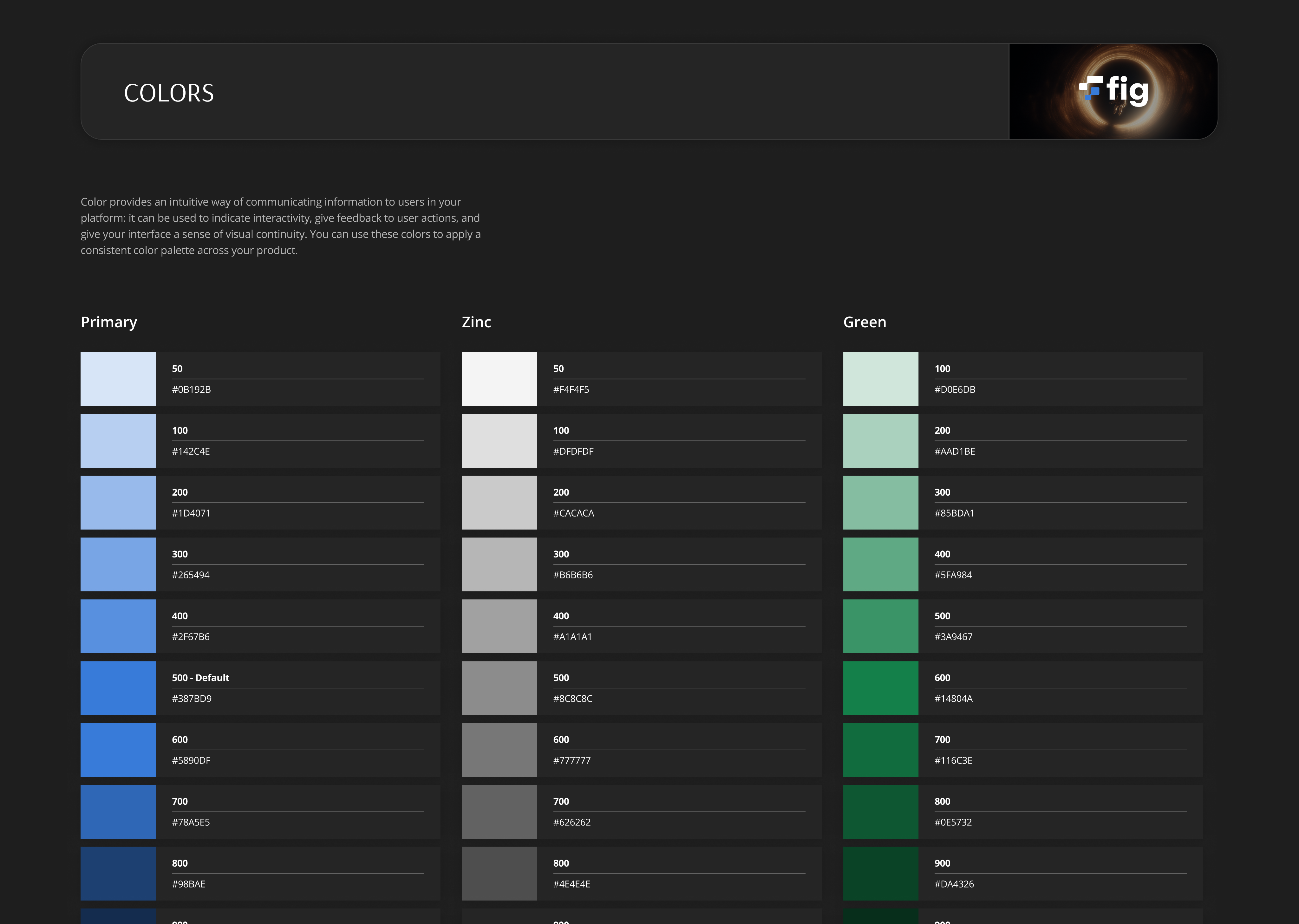
A system only works if the team can use it without me in the room. I documented [components / usage rules / do-and-don't examples — whatever's true] so designers and developers could build from it consistently after my involvement ended.
Designs
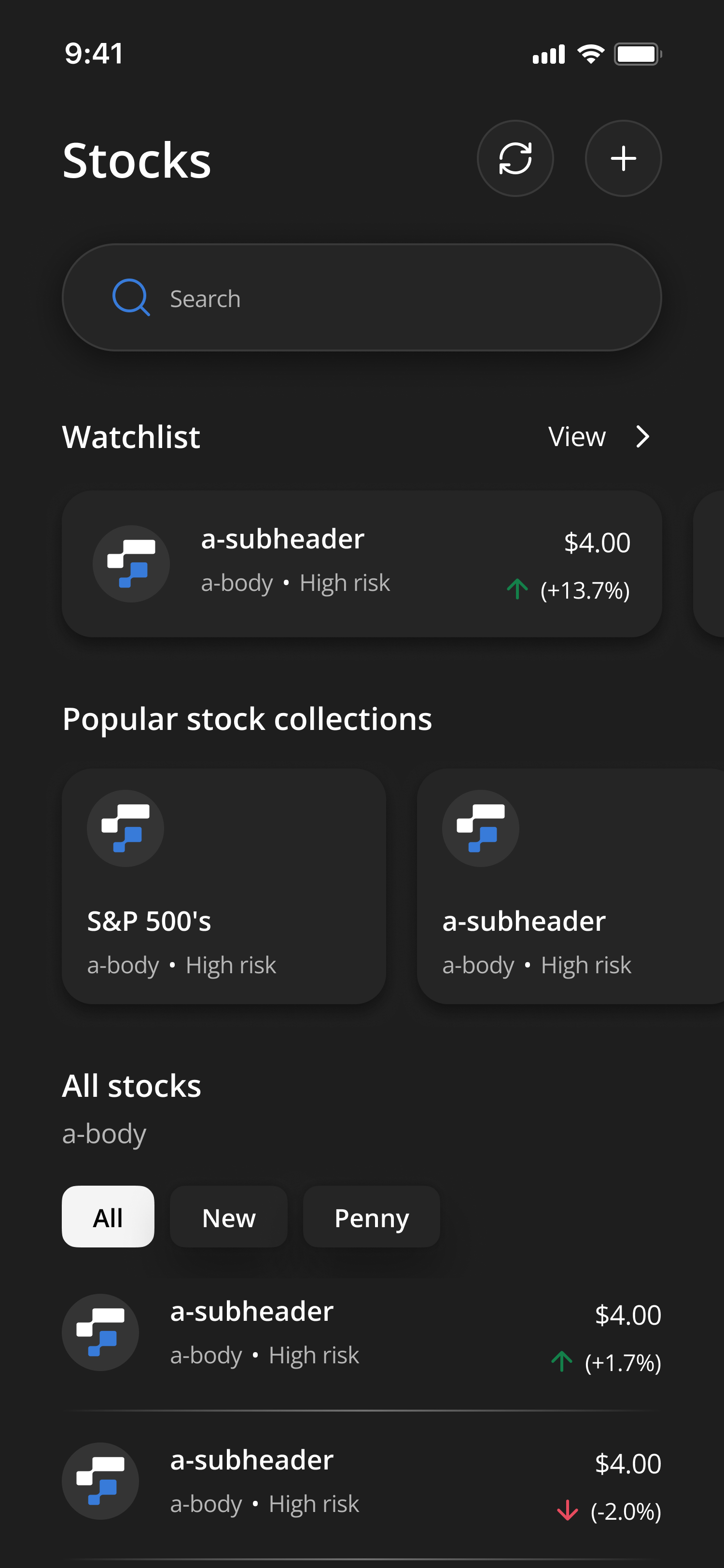
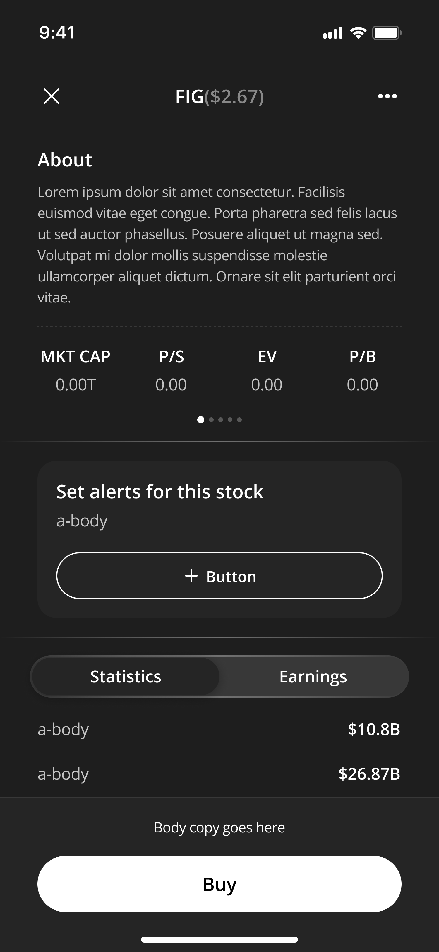
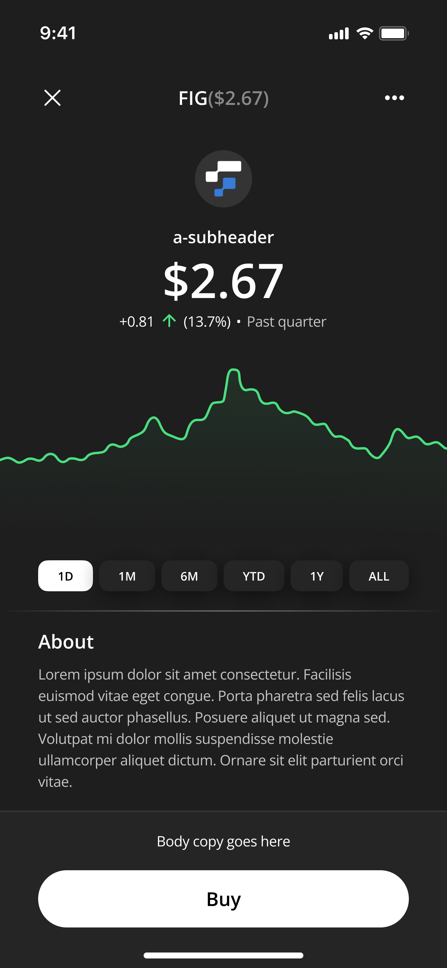
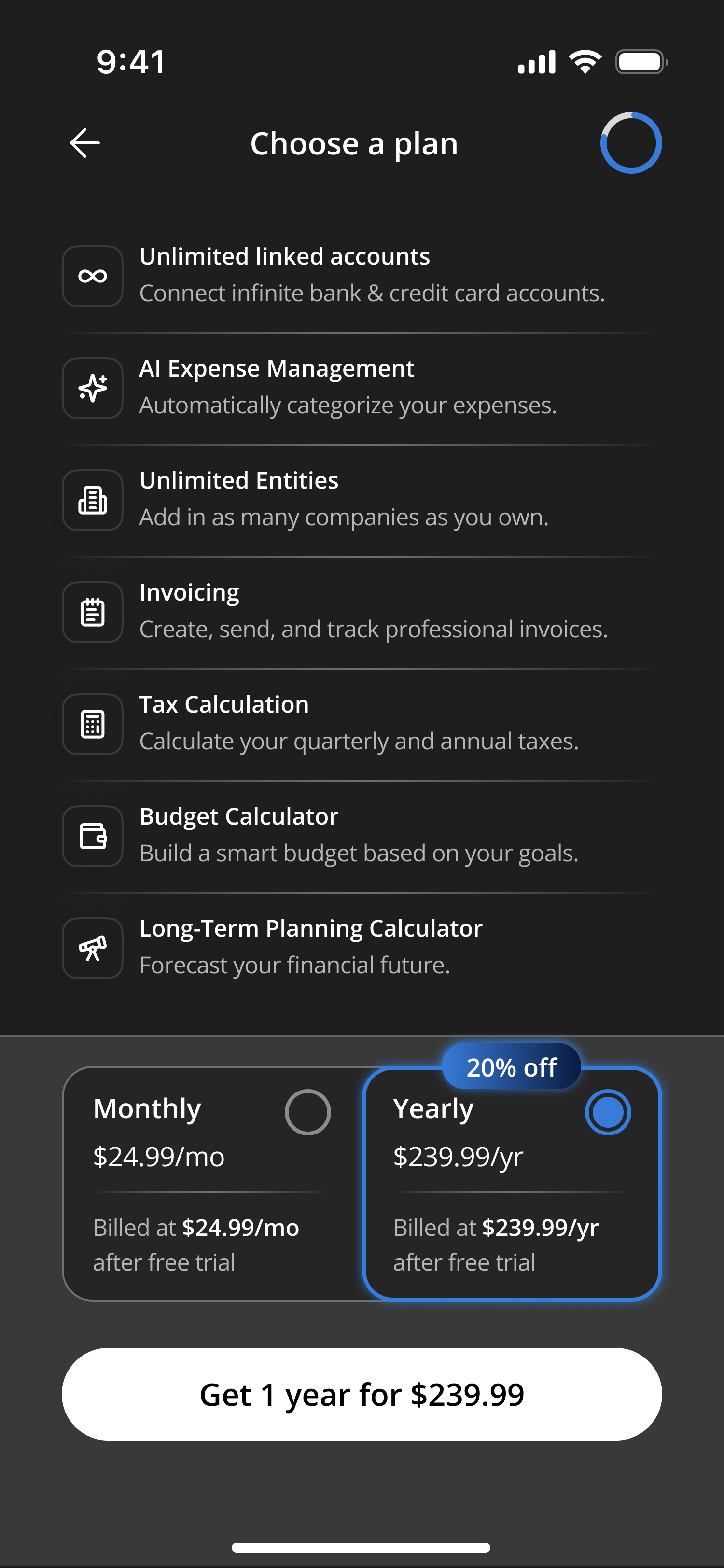
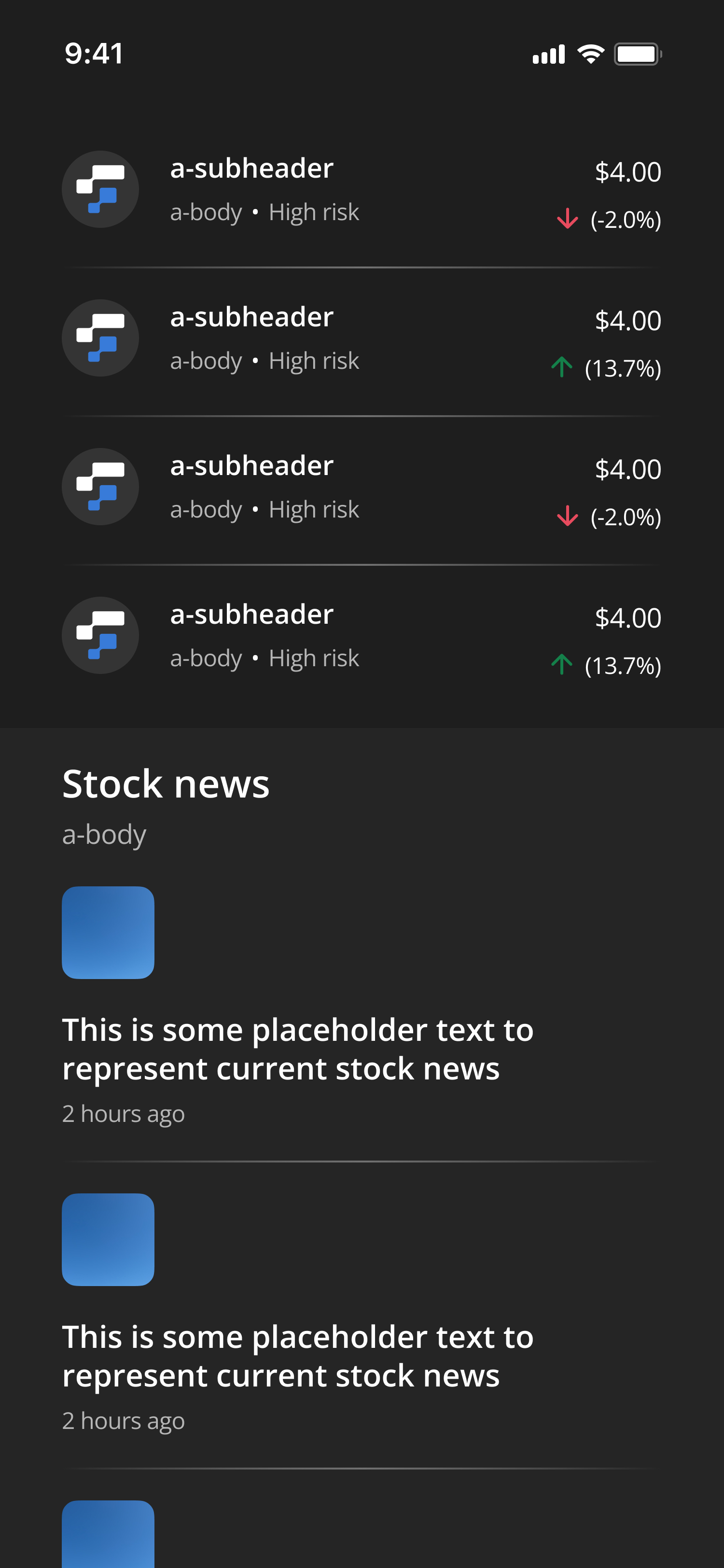
With the system in place, I designed [which pages/flows — the watchlist? buy flow? alerts?] using the new components, both to ship real screens and to pressure-test the system against real product needs.
Adrian T. Otoo
ktotoo627@gmail.com


Adrian T. Otoo
Contact me
Giving Fig a functioning design system, brand alignment and app design
September 2025 • FIG
Background
Fig is a fintech app for [investing / tracking stocks — describe what it actually does in one line]. I got the chance to work on it when I first joined Tethys Design Studio. Fig's product had been growing faster than its design foundations: the existing design system was out of date, and inconsistencies had crept into the app screen by screen.
The Problem
The system wasn't failing loudly, it was failing slowly. [What did you actually find — duplicated components? Multiple button styles? No token structure? Spacing drift? Name 2-3 real symptoms.] For the team, that meant every new screen took longer than it should, and the app's visual quality depended on which file you happened to be working in. A fintech product asking people to trust it with their money can't afford to look inconsistent.
My Approach
I audited the existing system to map what was actually in use versus what the library claimed, then migrated it to an atomic structure: tokens and foundations first, then components, then the patterns built from them. [Adjust to what you really did.]
Tasks
- Establishing the brand’s identity
- Building a scalable design system
- Redesigning key flows and features
Building the design system
[Concrete scope beats adjectives here. Anything true like: "consolidated X button variants into one component set," "rebuilt the color system into ramps with accessible contrast pairs," "defined a type scale to replace ad-hoc sizes." Even two specifics transform this section.]
Documentation after building
A system only works if the team can use it without me in the room. I documented [components / usage rules / do-and-don't examples — whatever's true] so designers and developers could build from it consistently after my involvement ended.
Designs
With the system in place, I designed [which pages/flows — the watchlist? buy flow? alerts?] using the new components, both to ship real screens and to pressure-test the system against real product needs.
Adrian T. Otoo
ktotoo627@gmail.com
Adrian T. Otoo
Contact me
Giving Fig a functioning design system, brand alignment and app design
September 2025 • FIG
Background
Fig is a fintech app for [investing / tracking stocks — describe what it actually does in one line]. I got the chance to work on it when I first joined Tethys Design Studio. Fig's product had been growing faster than its design foundations: the existing design system was out of date, and inconsistencies had crept into the app screen by screen.
The Problem
The system wasn't failing loudly, it was failing slowly. [What did you actually find — duplicated components? Multiple button styles? No token structure? Spacing drift? Name 2-3 real symptoms.] For the team, that meant every new screen took longer than it should, and the app's visual quality depended on which file you happened to be working in. A fintech product asking people to trust it with their money can't afford to look inconsistent.
My Approach
I audited the existing system to map what was actually in use versus what the library claimed, then migrated it to an atomic structure: tokens and foundations first, then components, then the patterns built from them. [Adjust to what you really did.]
Tasks
- Establishing the brand’s identity
- Building a scalable design system
- Redesigning key flows and features
Building the design system
[Concrete scope beats adjectives here. Anything true like: "consolidated X button variants into one component set," "rebuilt the color system into ramps with accessible contrast pairs," "defined a type scale to replace ad-hoc sizes." Even two specifics transform this section.]
Documentation after building
A system only works if the team can use it without me in the room. I documented [components / usage rules / do-and-don't examples — whatever's true] so designers and developers could build from it consistently after my involvement ended.
Designs
With the system in place, I designed [which pages/flows — the watchlist? buy flow? alerts?] using the new components, both to ship real screens and to pressure-test the system against real product needs.
Adrian T. Otoo
ktotoo627@gmail.com