Adrian T. Otoo
Contact me
Giving Squaft a rebrand and design refresh
Background
Client is an early-stage startup offering a zero-commission rental marketplace allowing users to list and rent out backyards, storage spaces, and short-term accommodations. When the founders first approached me, they were preparing to seek investment and needed their product to reflect the quality and clarity of their vision. The existing website and web app told a different story.
The Problem
The product had real potential, but the experience was working against it. The website suffered from poor UX writing, unstructured page layouts, and no clear visual hierarchy making it difficult for visitors to understand what Client actually offered. The web app had deeper issues: buttons were misplaced, cards failed basic accessibility standards, and there was no consistent brand identity threading through the experience.
The core challenge wasn't just visual. It was trust. A platform asking users to hand over their spaces or pay to rent someone else's needs to feel reliable and professional. This one didn't yet.
My Approach
Before touching visuals, I audited what existed and restructured the information architecture. The goal was to establish a logical foundation making sure each page had a clear purpose, content was prioritized by user need, and the flows made intuitive sense before any design decisions were layered on top.
Tasks
Importance
Establishing the brand’s identity
Building a scalable design system
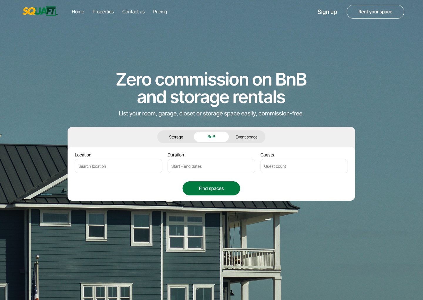
Redesigning key flows and features
Establishing a brand identity
I conducted a competitor audit to understand the landscape and identify opportunities to differentiate. From there, I worked closely with the founders to establish a brand identity that could carry through consistently one that felt trustworthy, modern, and distinct from the generic aesthetic the original product had defaulted to.
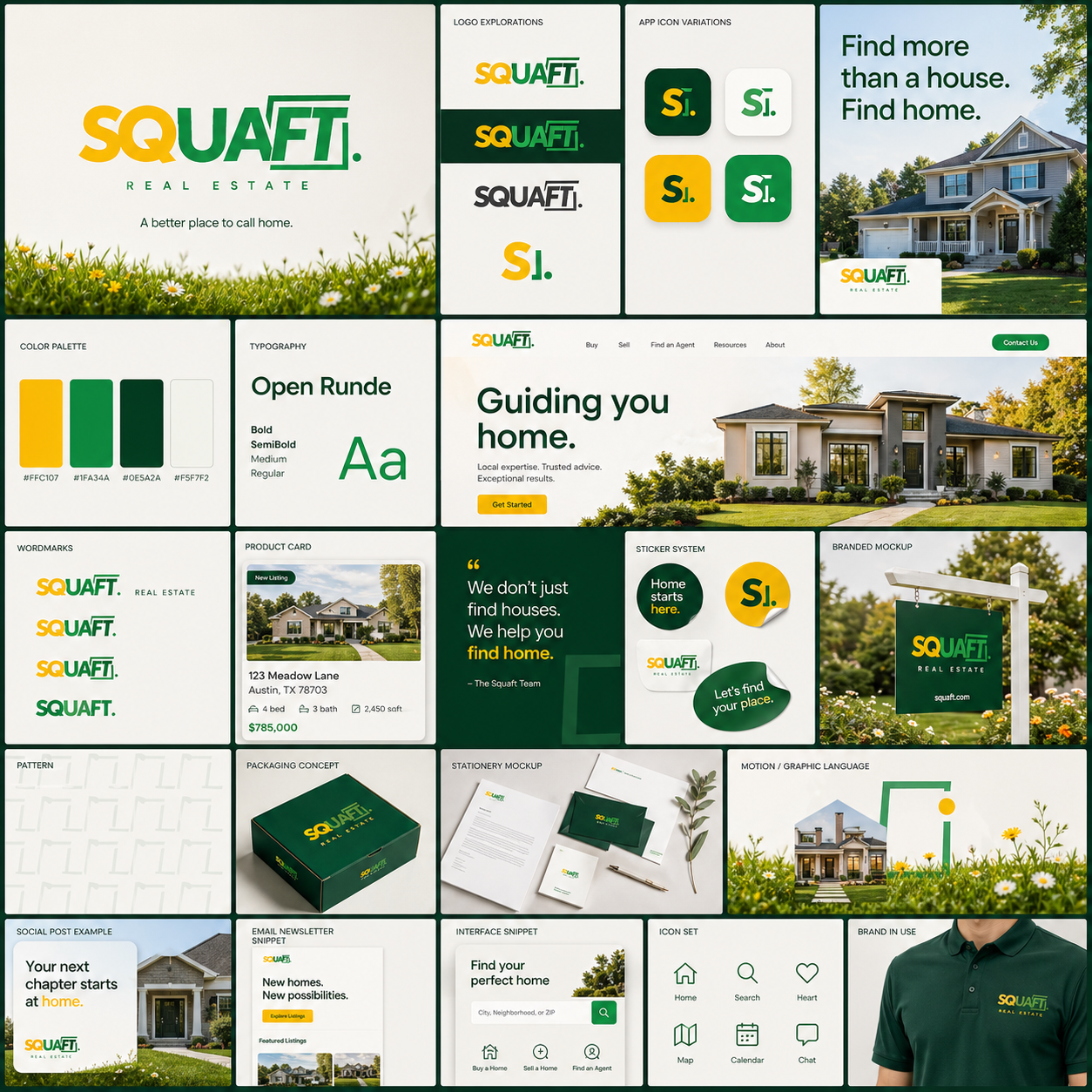
Building a scalable design system
With a brand direction established, I built a design system from the ground up. This gave the product a shared visual language consistent typography, color, spacing, and components and ensured that accessibility issues like the broken card patterns were corrected systematically rather than one-off.
Key Flows & Features Redesigned
Property Listing Flow: Redesigned the end-to-end flow for hosts creating a listing, reducing friction and making the steps feel guided and clear.
In-App Property Management: Improved the management experience for hosts so that tracking and updating their listings felt organized rather than scattered.
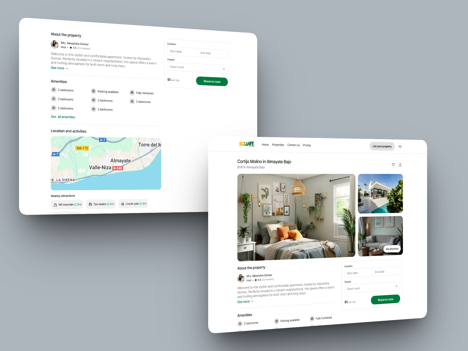
Property Detail Page: Restructured the page so that critical information; property type, location, availability, and pricing was surfaced immediately. Users no longer had to hunt for the details they needed to make a decision.
Search & Discovery: Refined the search criteria to be more intuitive, and redesigned the property cards to communicate everything a user needs at a glance: name, location, property type, rating, and price.
Conclusion
While the designs were not pushed to development due to internal team constraints, the work produced a measurable shift in perception. During internal user testing with the founders, the team noted a drastic improvement in both the user experience and the visual appeal of the product compared to the original. The redesign gave Client a credible, investment-ready product story which was the original goal when we first engaged
Adrian T. Otoo
Contact me
Giving Squaft a rebrand and design refresh
Background
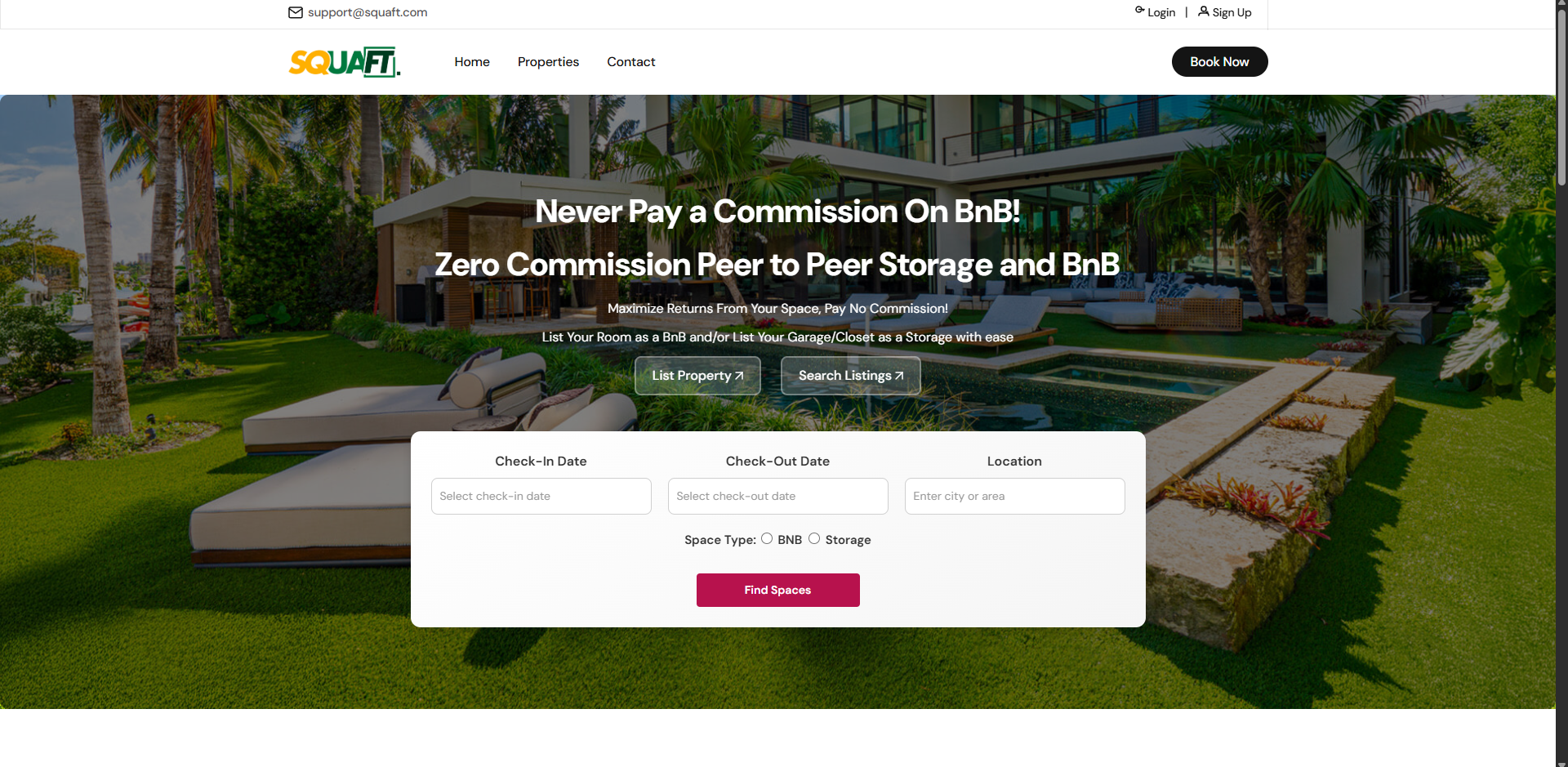
Client is an early-stage startup offering a zero-commission rental marketplace allowing users to list and rent out backyards, storage spaces, and short-term accommodations. When the founders first approached me, they were preparing to seek investment and needed their product to reflect the quality and clarity of their vision. The existing website and web app told a different story.
The Problem
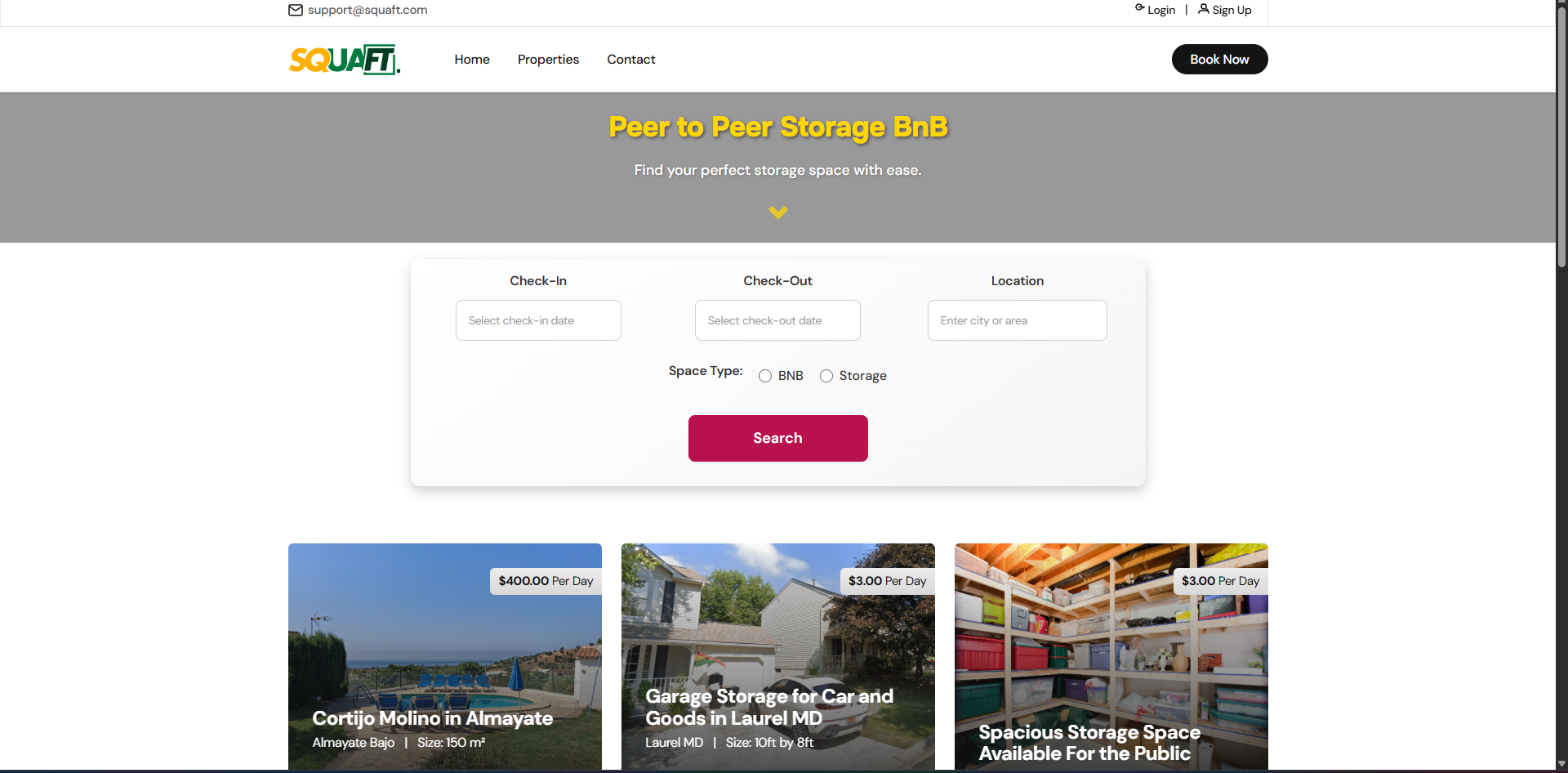
The product had real potential, but the experience was working against it. The website suffered from poor UX writing, unstructured page layouts, and no clear visual hierarchy making it difficult for visitors to understand what Client actually offered. The web app had deeper issues: buttons were misplaced, cards failed basic accessibility standards, and there was no consistent brand identity threading through the experience.
The core challenge wasn't just visual. It was trust. A platform asking users to hand over their spaces or pay to rent someone else's needs to feel reliable and professional. This one didn't yet.
My Approach
Before touching visuals, I audited what existed and restructured the information architecture. The goal was to establish a logical foundation making sure each page had a clear purpose, content was prioritized by user need, and the flows made intuitive sense before any design decisions were layered on top.
Tasks
Importance
Establishing the brand’s identity
Building a scalable design system
Redesigning key flows and features
Establishing a brand identity
I conducted a competitor audit to understand the landscape and identify opportunities to differentiate. From there, I worked closely with the founders to establish a brand identity that could carry through consistently one that felt trustworthy, modern, and distinct from the generic aesthetic the original product had defaulted to.
Building a scalable design system
With a brand direction established, I built a design system from the ground up. This gave the product a shared visual language consistent typography, color, spacing, and components and ensured that accessibility issues like the broken card patterns were corrected systematically rather than one-off.
Key Flows & Features Redesigned
Property Listing Flow: Redesigned the end-to-end flow for hosts creating a listing, reducing friction and making the steps feel guided and clear.
In-App Property Management: Improved the management experience for hosts so that tracking and updating their listings felt organized rather than scattered.
Property Detail Page: Restructured the page so that critical information; property type, location, availability, and pricing was surfaced immediately. Users no longer had to hunt for the details they needed to make a decision.
Search & Discovery: Refined the search criteria to be more intuitive, and redesigned the property cards to communicate everything a user needs at a glance: name, location, property type, rating, and price.
Conclusion
While the designs were not pushed to development due to internal team constraints, the work produced a measurable shift in perception. During internal user testing with the founders, the team noted a drastic improvement in both the user experience and the visual appeal of the product compared to the original. The redesign gave Client a credible, investment-ready product story which was the original goal when we first engaged
Adrian T. Otoo
Contact me
Giving Squaft a rebrand and design refresh
Background
Client is an early-stage startup offering a zero-commission rental marketplace allowing users to list and rent out backyards, storage spaces, and short-term accommodations. When the founders first approached me, they were preparing to seek investment and needed their product to reflect the quality and clarity of their vision. The existing website and web app told a different story.
The Problem
The product had real potential, but the experience was working against it. The website suffered from poor UX writing, unstructured page layouts, and no clear visual hierarchy making it difficult for visitors to understand what Client actually offered. The web app had deeper issues: buttons were misplaced, cards failed basic accessibility standards, and there was no consistent brand identity threading through the experience.
The core challenge wasn't just visual. It was trust. A platform asking users to hand over their spaces or pay to rent someone else's needs to feel reliable and professional. This one didn't yet.
My Approach
Before touching visuals, I audited what existed and restructured the information architecture. The goal was to establish a logical foundation making sure each page had a clear purpose, content was prioritized by user need, and the flows made intuitive sense before any design decisions were layered on top.
Tasks
Importance
Establishing the brand’s identity
Building a scalable design system
Redesigning key flows and features
Establishing a brand identity
I conducted a competitor audit to understand the landscape and identify opportunities to differentiate. From there, I worked closely with the founders to establish a brand identity that could carry through consistently one that felt trustworthy, modern, and distinct from the generic aesthetic the original product had defaulted to.
Building a scalable design system
With a brand direction established, I built a design system from the ground up. This gave the product a shared visual language consistent typography, color, spacing, and components and ensured that accessibility issues like the broken card patterns were corrected systematically rather than one-off.
Key Flows & Features Redesigned
Property Listing Flow: Redesigned the end-to-end flow for hosts creating a listing, reducing friction and making the steps feel guided and clear.
In-App Property Management: Improved the management experience for hosts so that tracking and updating their listings felt organized rather than scattered.
Property Detail Page: Restructured the page so that critical information; property type, location, availability, and pricing was surfaced immediately. Users no longer had to hunt for the details they needed to make a decision.
Search & Discovery: Refined the search criteria to be more intuitive, and redesigned the property cards to communicate everything a user needs at a glance: name, location, property type, rating, and price.
Conclusion
While the designs were not pushed to development due to internal team constraints, the work produced a measurable shift in perception. During internal user testing with the founders, the team noted a drastic improvement in both the user experience and the visual appeal of the product compared to the original. The redesign gave Client a credible, investment-ready product story which was the original goal when we first engaged